
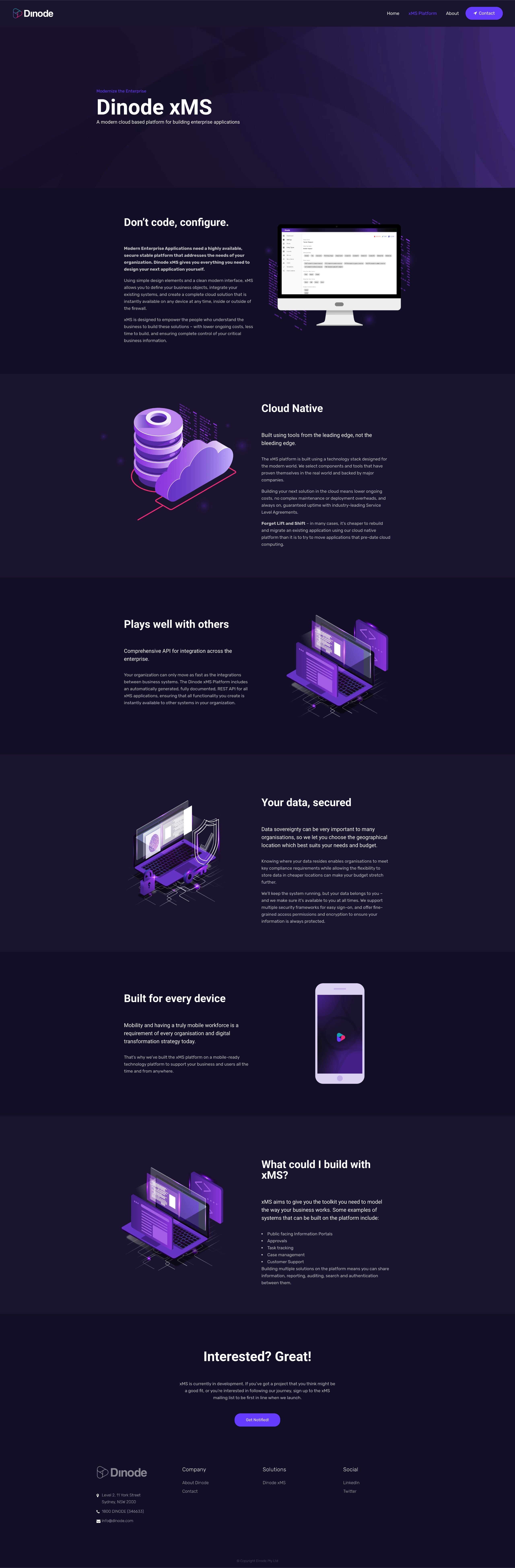
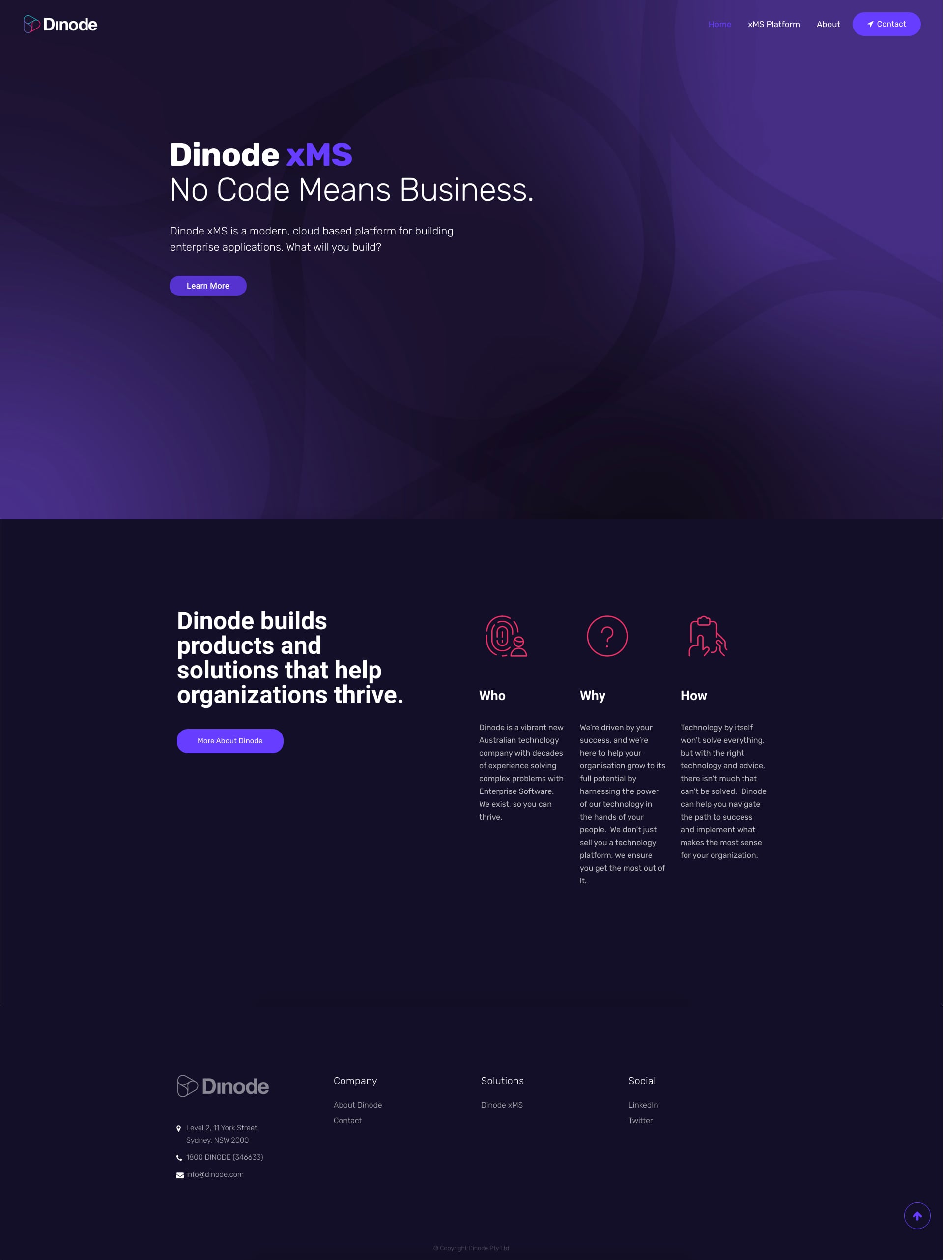
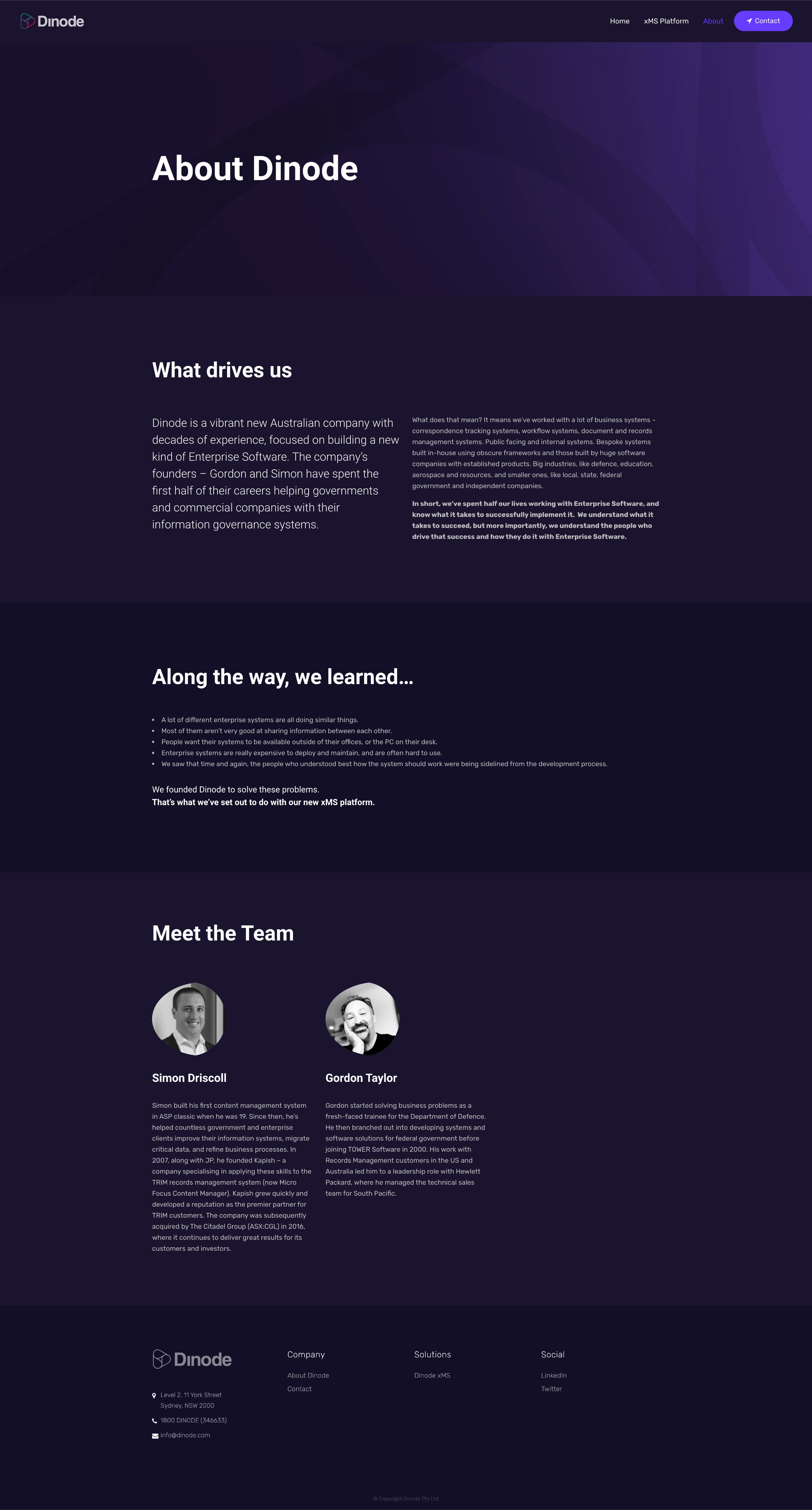
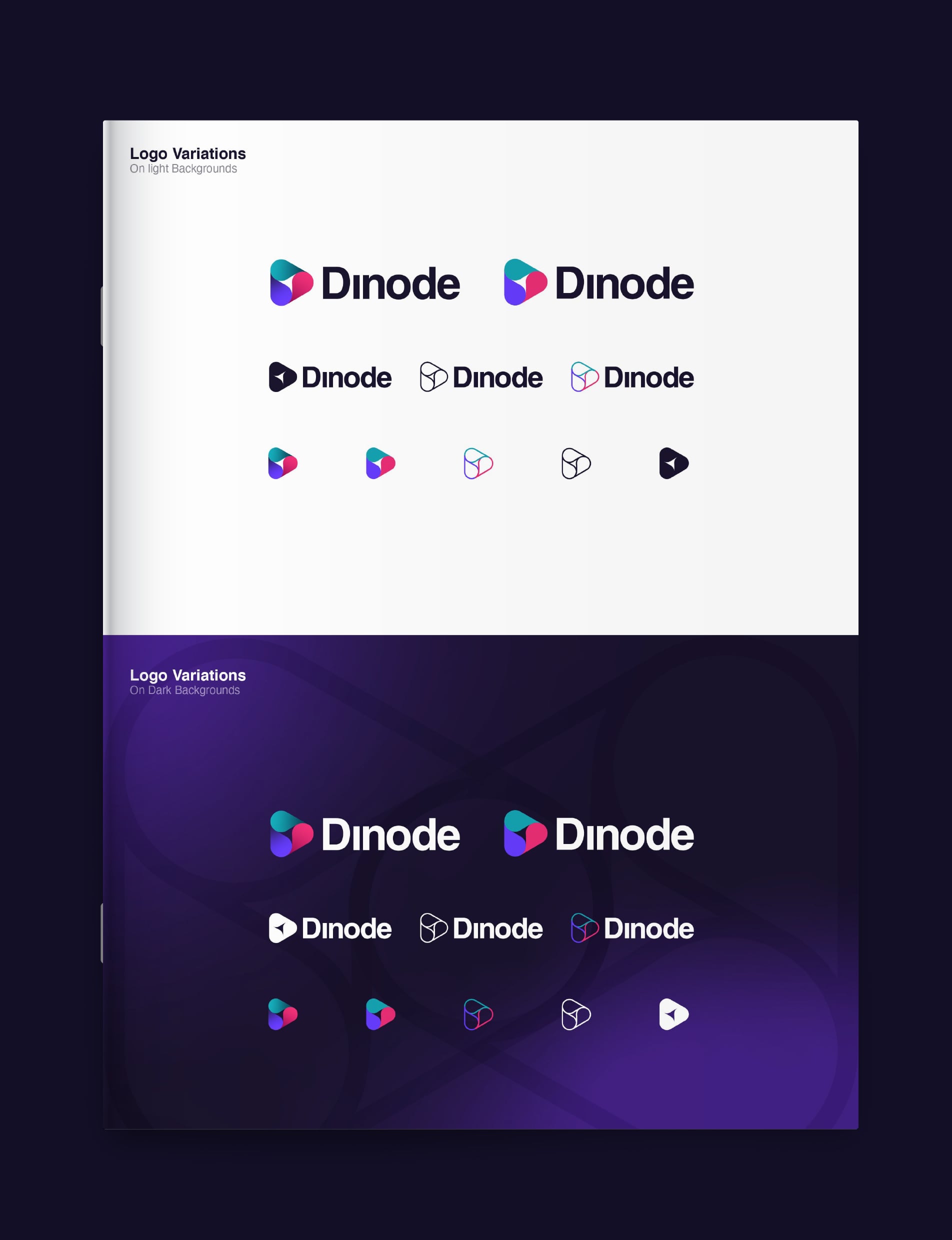
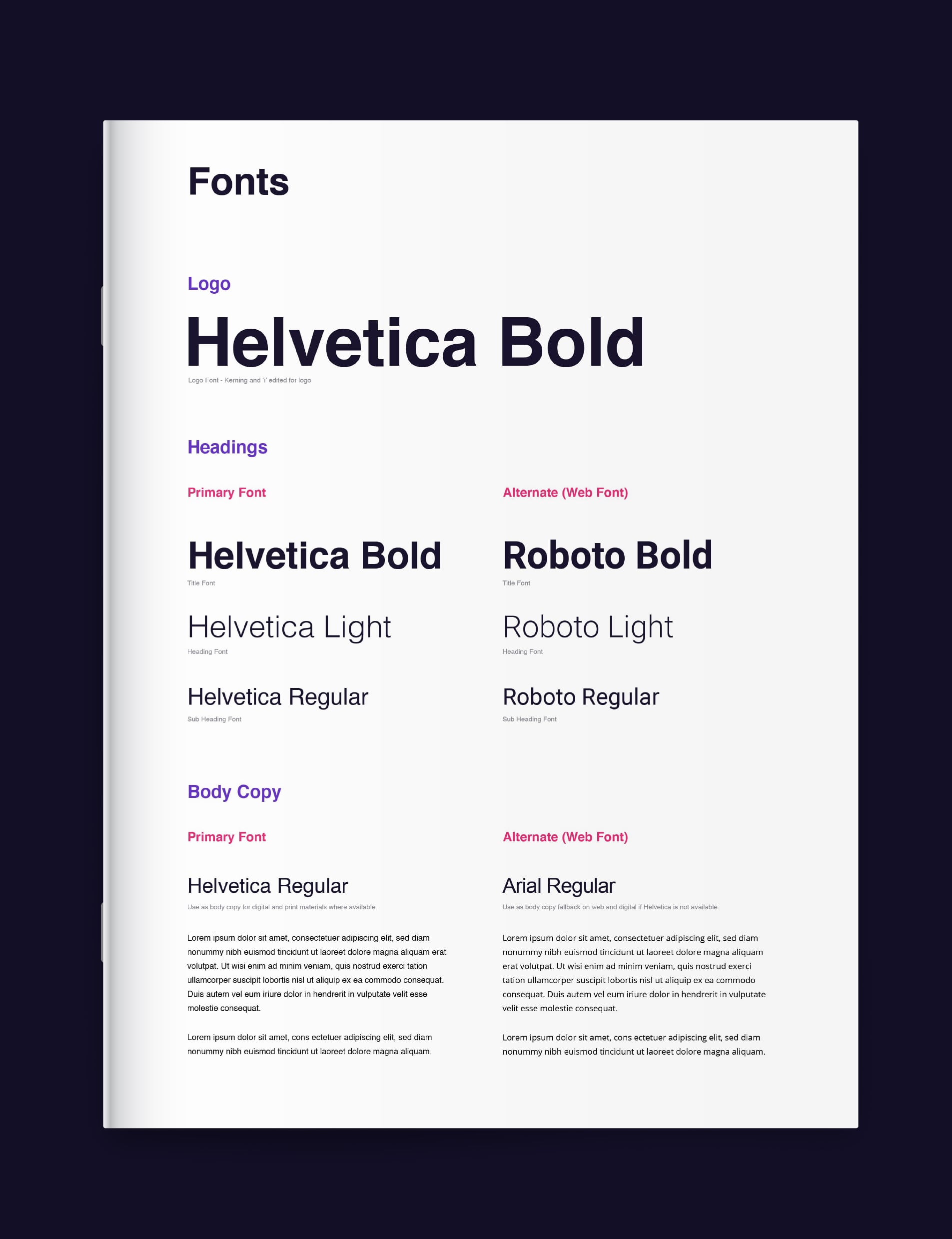
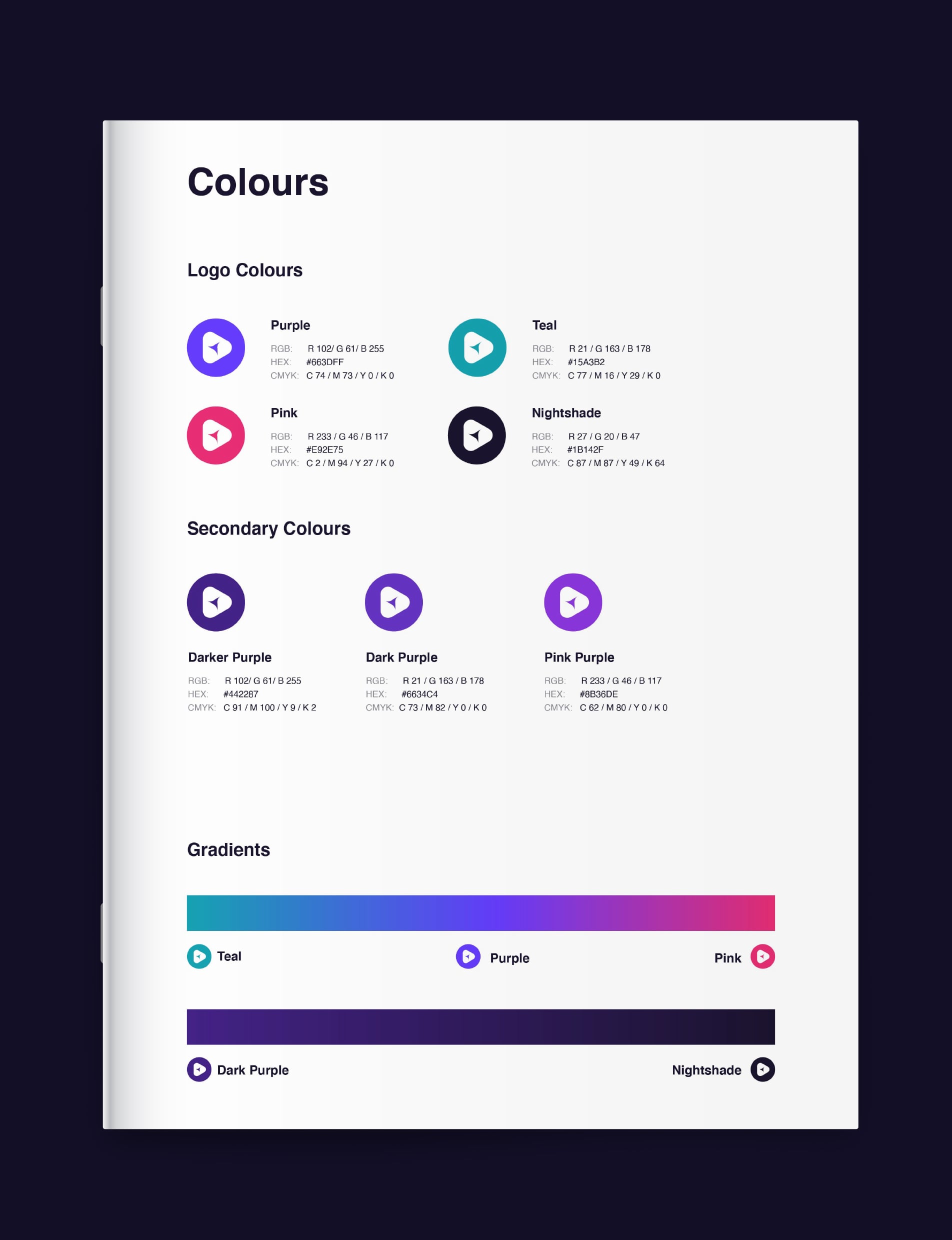
From this base, a number of concepts were drawn up and thrown about before landing on this super simple design. Nothing fancy, but plenty of meaning. A colour palette that stands out from the crowd and an unassuming font which is clear and easy to read at any size, from any distance. A dark base is used wherever possible, following the ever popular “dark mode” trend used in most high profile software at present.
The website follows suit, presenting minimal fuss, limited content that gets straight to the point and a dark theme thats easy on the eyes and scales to all devices seamlessly.
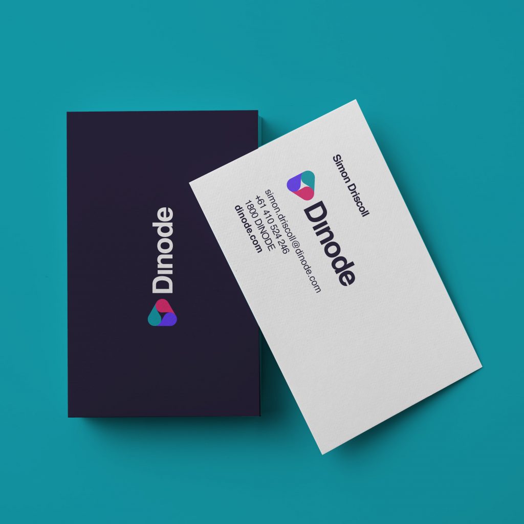
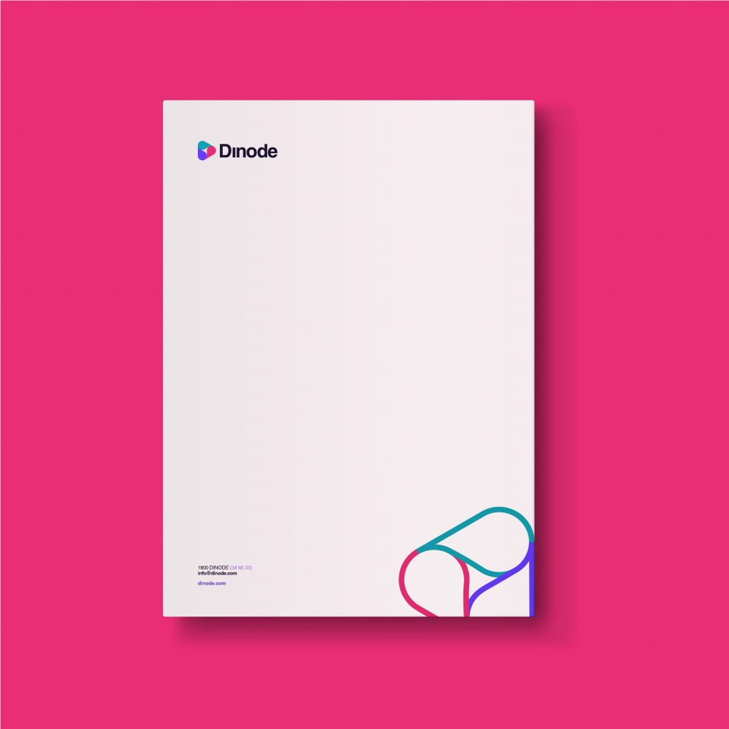
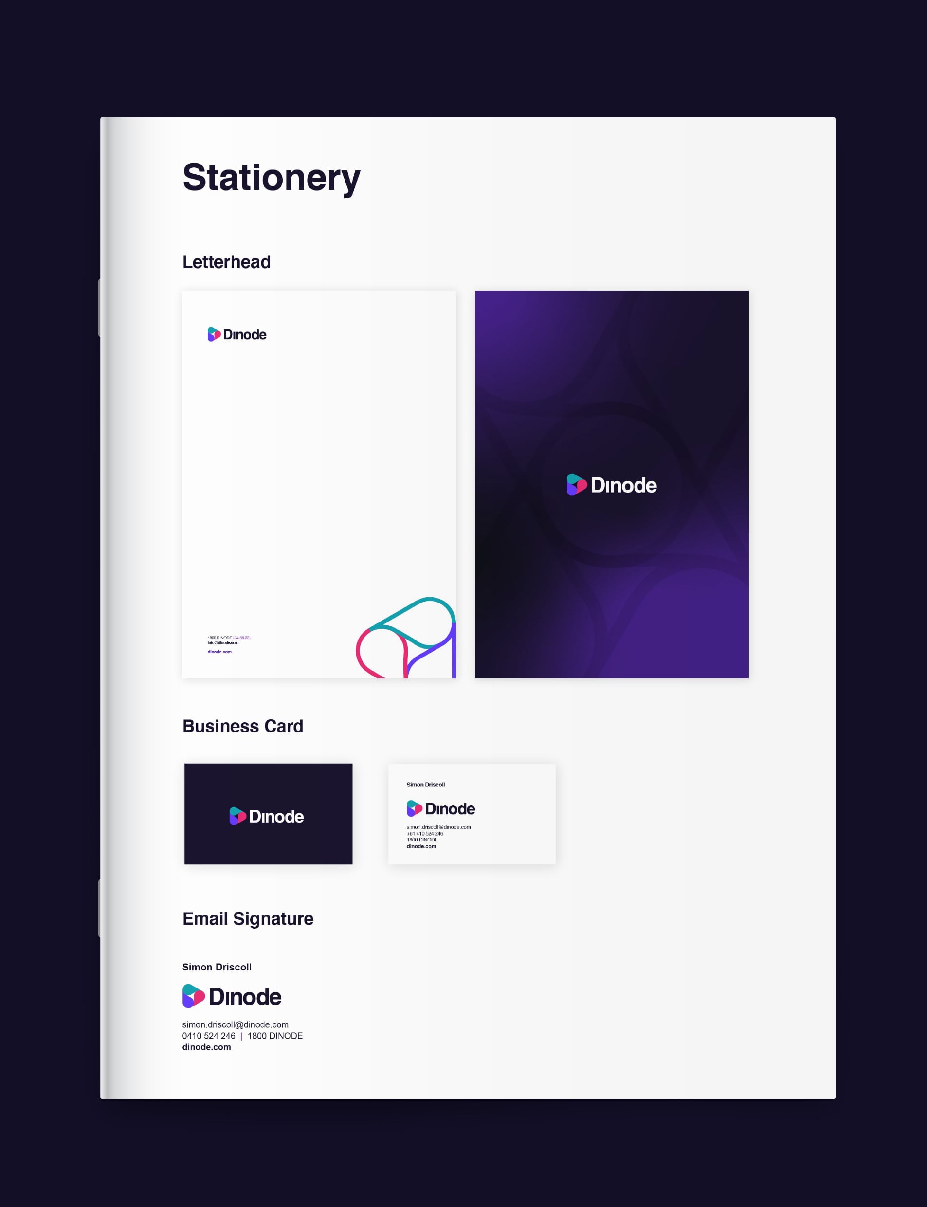
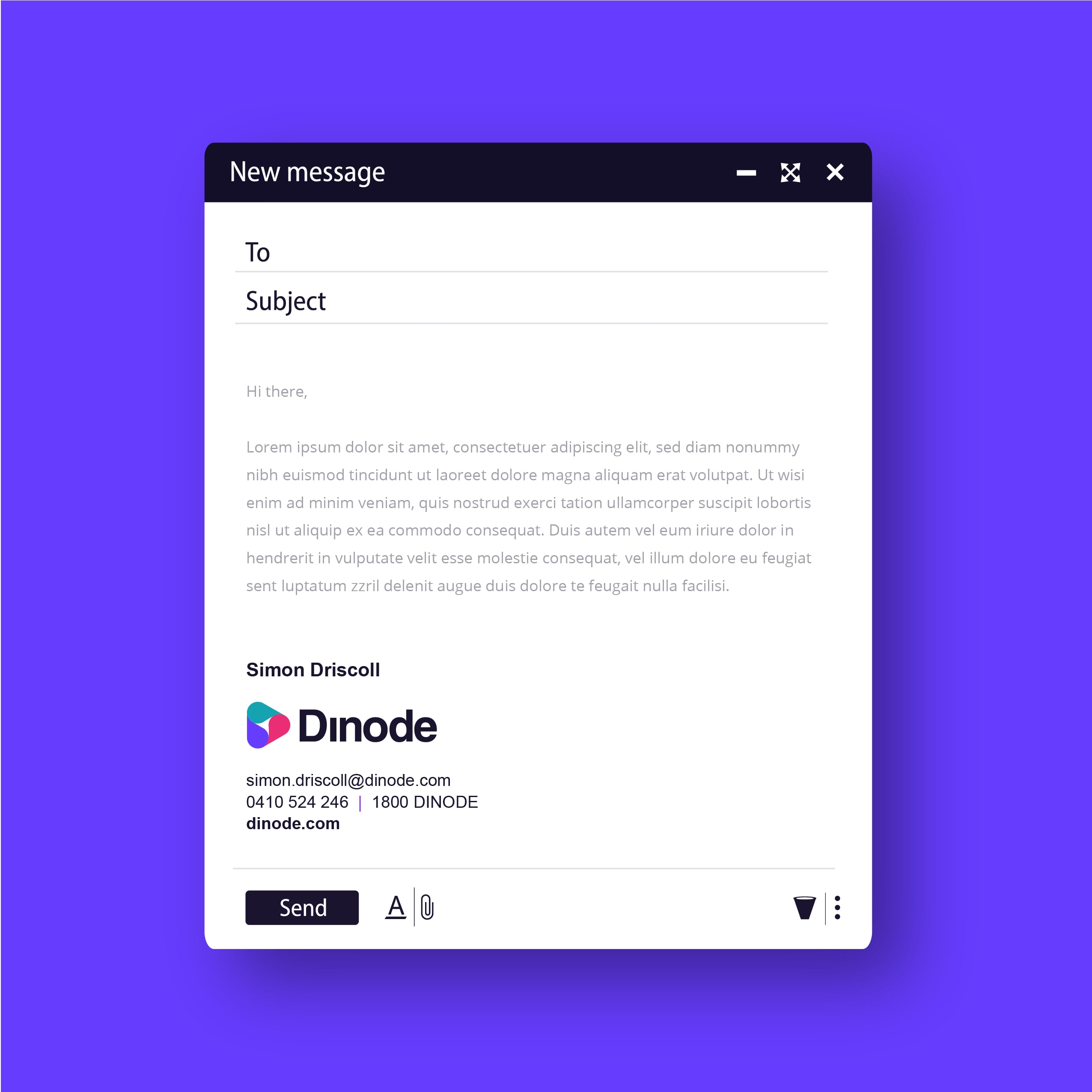
This meant creating a full suite of stationery, with the hero being business cards that didn’t just look at home with enterprise grade software providers, it made them green with envy. Super thick stock, coloured edges and uncoated stock that you couldn’t help but want to rub between your fingers when it’s handed to you.
This means that at every interaction with Dinode, you are met with a clean, well presented and consistent brand that instils confidence with all those who come in contact with it. Customers will always feel they have made the right choice, because wether consiously or not, people feel that if you pay attention to the little things, you must have paid attention to the big things too. Much like Van Halen’s infamous rider for brown m&m’s to be removed from bowls of the candy back stage.
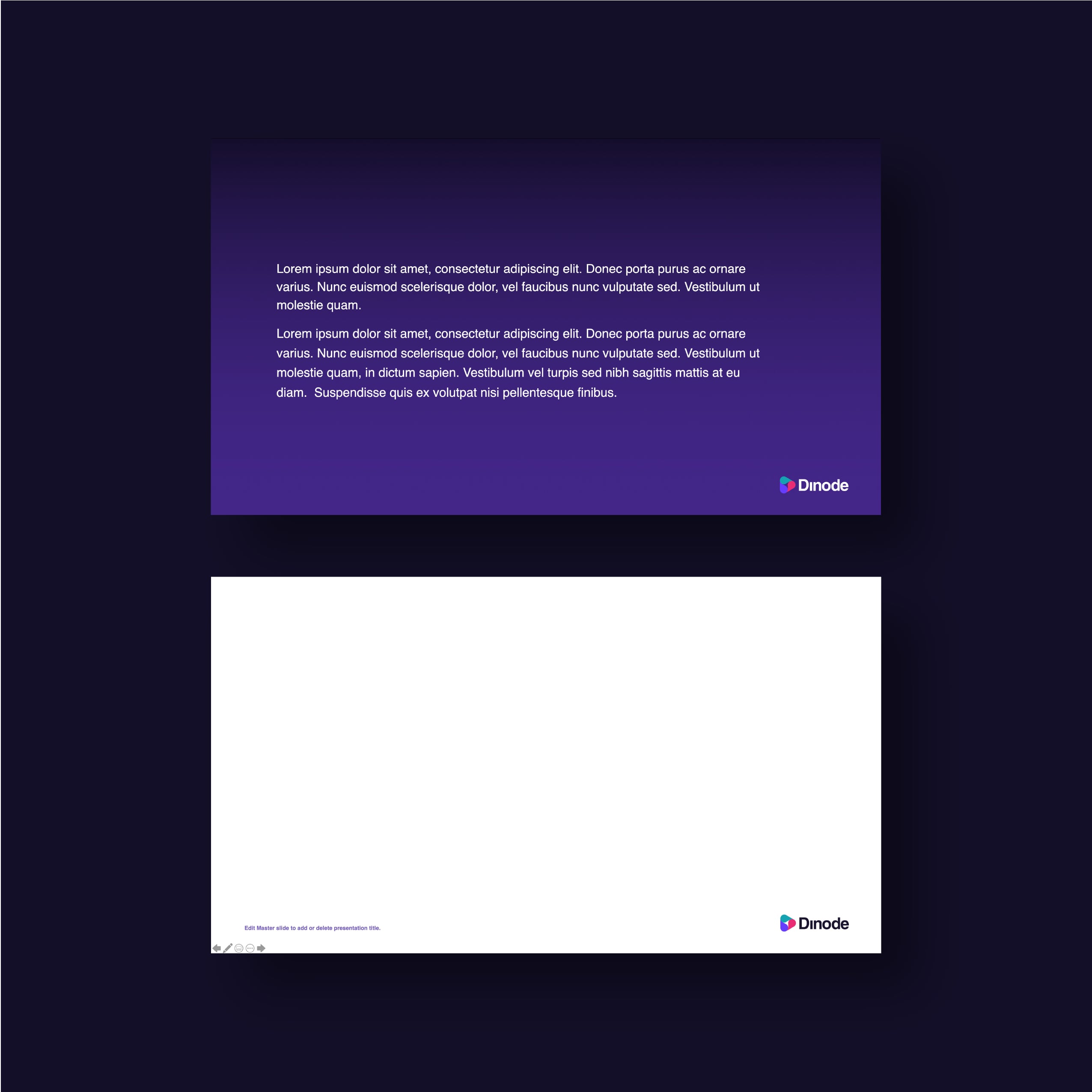
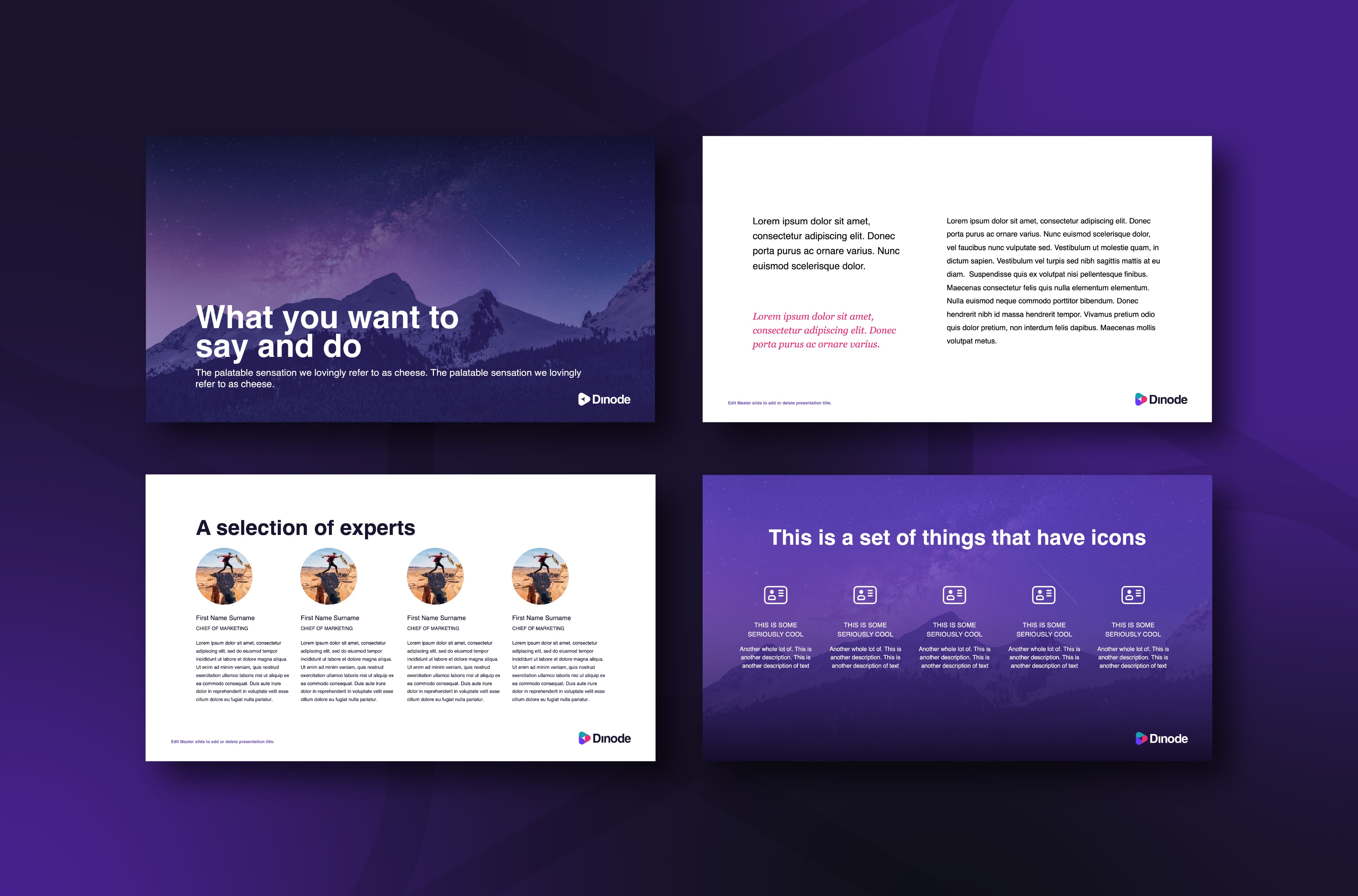
A presentation deck can make or break any pitch, especially with enterprise grade proposals. Dinode needed the mother of all powerpoints to present their game changing software to some seriously high level clientele. With over 120 different layouts, and a completely custom made master template, they are able to quickly and easily create a world class deck that would make even the most uninterested customer stand up and take note.